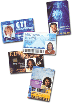
It is easy to duplicate a white card with a logo and name on it. There are additional security measures you may wish to consider when designing your id card for maximum security.
1. To begin the graphic design process, you may find it helpful to divide your card up into a grid. Place the larger and fixed elements into the card first and determine whether the card will be veritical or horizontal. Remember to leave a placeholder for the badge slot punch if there will be one on your cards.
2. Use color in your card. Avoid extremes. Dark colors are hard to read and light colors make the card look washed out. Bright colors work best with variance in color to distinguish different levels of access or achievement.
3. A colored photo of the cardholder as large as possible on the card increases the security of the card. A colored photo is more secure than a black and white picture. Although high resolution is important, a picture size that is too large will be combersome in some computers and id badge design programs.
4. Choose a good font or fonts that appeal to the reader and are in good taste. Too many fonts on the card are distracting. Often a sans serif font is recommended for the text.
5. You may wish to incorporate a hologram on the card. The hologram can be clear, a standard pattern or custom. The protective overlay makes it difficult for counterfeiters to reproduce.
6. If your budget allows for an advanced printer, you may wish to consider a printer that uses reverse image printing technology. The security level of these cards are greater than a standard direct-to-card print. With the additional benefits of a better quality print and durability of the cards, some organizations choose to go this route.
If you have additional questions about id card printing, contact our id card experts at 888-485-4696. We provide and service Asure Software, ID Flow Software, EpiSuite, Fargo printer models, Evolis printer models, CIM printer models and Magicard printer models.

I appreciate your tip to set up the id card onto a grid in order to make everything proportional. I had an id card from a company once that did a bad job with sizing the photograph on the card and so it stretched our faces out. I didn’t think of something as simple as setting up a grid to avoid that mistake; I’ll be doing that the next time I make a custom id card.